TRIKAYA
GAME DESCRIPTION
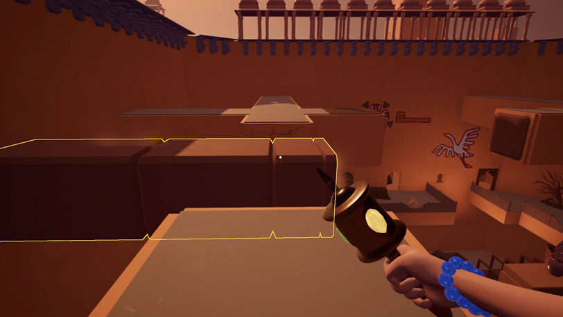
Trikaya is a first-person puzzle game where the player explores a long-forgotten temple and pieces together a mighty and mysterious artifact to master magic and uncover the intriguing history of the extraordinary artifact.
-
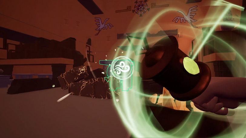
Collect the Wind gem to summon powerful gusts of wind to mobilize objects
-
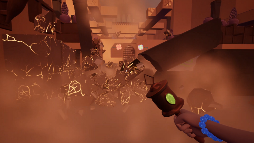
Acquire the Earth gem to create a mass of rock and generate great pillars
-
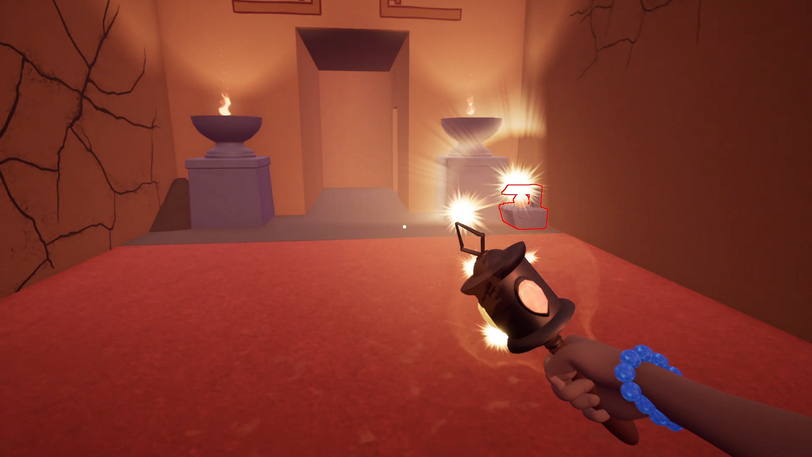
Obtain the Fire gem to incinerate objects and reveal hidden paths
RESPONSIBILITY
Role: Lead Game Designer
Responsibility:
-
Owned the full vision for the game
-
Attended daily lead meetings and discussed ideas
-
Provided detailed references for functions, UI, VFX, and music
-
Designed and refined levels to support the intended gameplay
TEAM INFO
Team Name:
Team Size:
Game Genre:
Team 134b @SMU Guildhall C29
11
1st person puzzle game
Engine:
Develop Time:
Shipped Date:
Unreal Engine 4
16 Weeks
01/18/2021
GAME TRAILER
GALLERY
FULL WALKTHROUGH
SPELL CASTING SYSTEM DESIGN
Design Goals:
-
To design a system serving for players to summon elemental abilities
Steps:
-
I created a flow chart to help me break down the sequences into three stages, Before Casting Stage, In Casting Stage, and After Casting Stage. Then I was able to list all the function and visual feedback we need, including player animations, object sequences, VFX, and SFX.

Spell Casting Sequences
2. We took inspiration from the cartoon Avatar: The Last Airbender as a useful reference, researched its remarkable bending shots, and planed interaction on better visual effect.
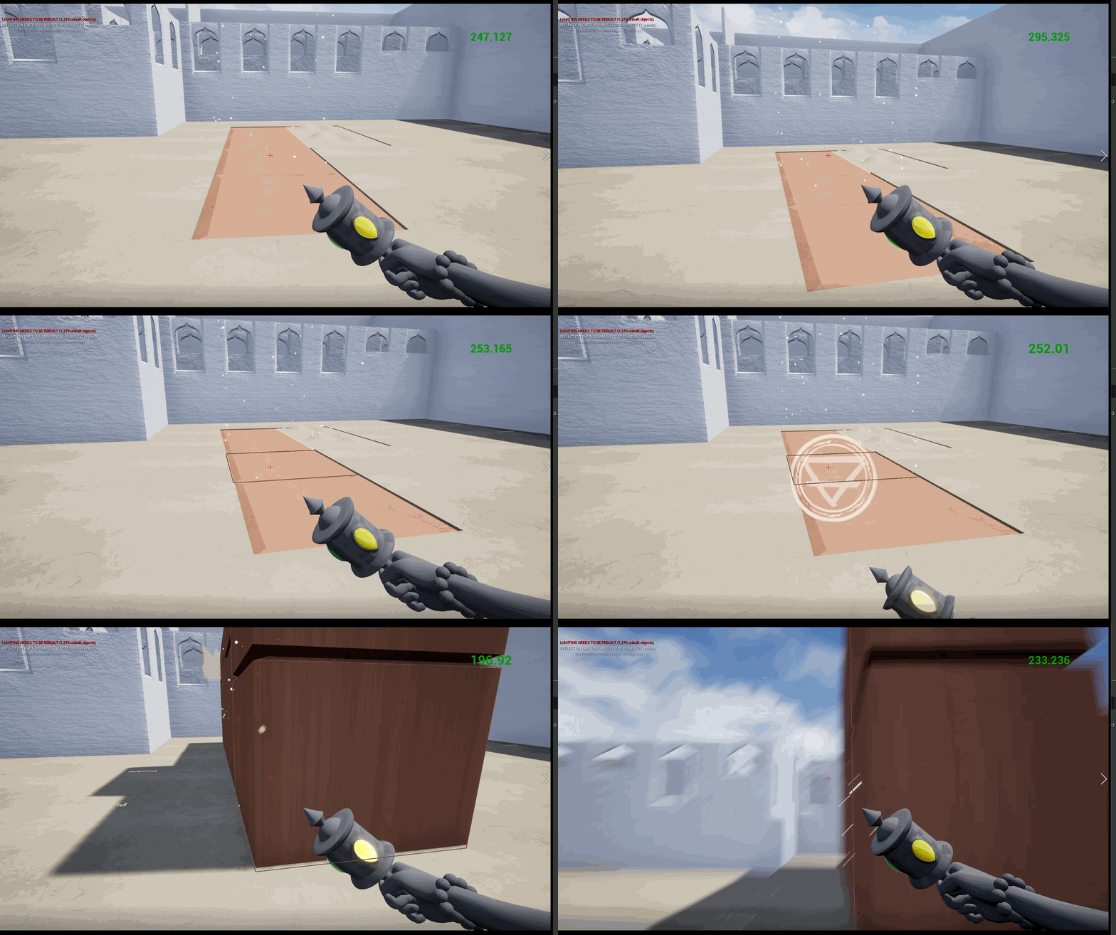
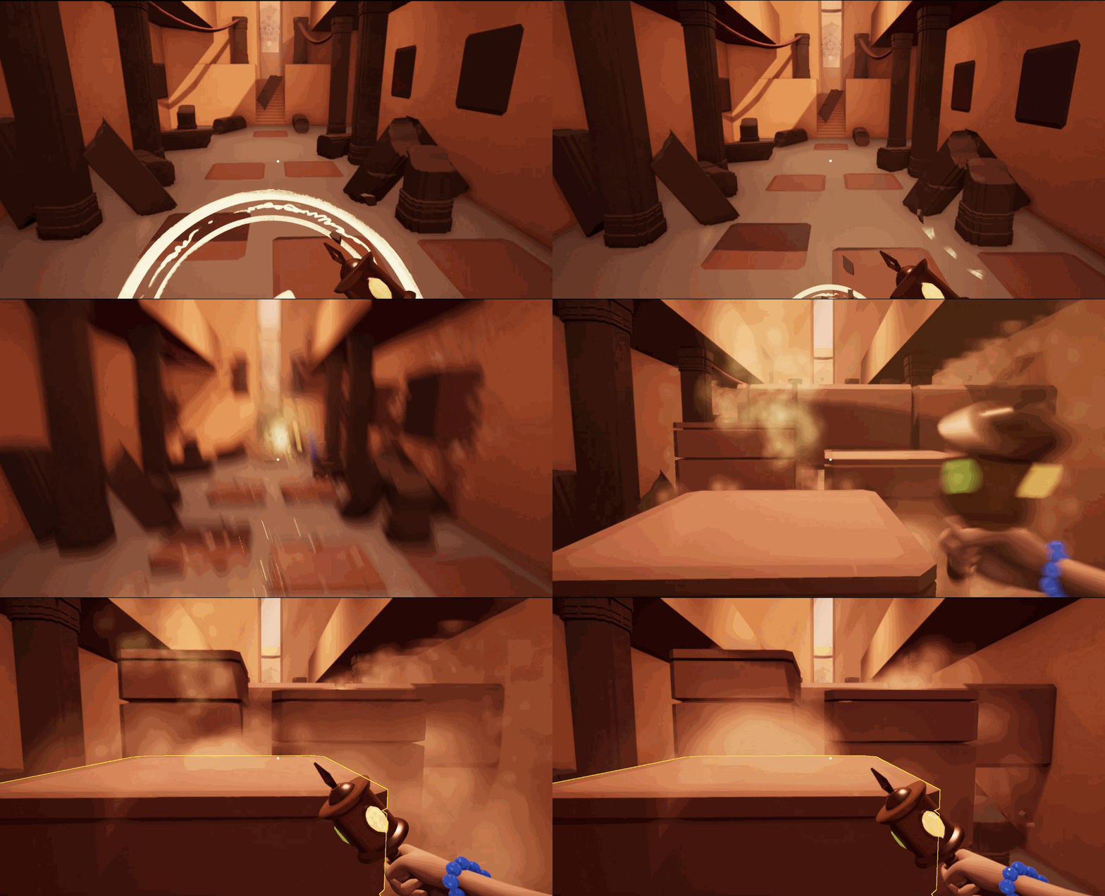
Example 1:
Prototype Stage
The player casting the Earth Spell.
Solutions for Example 1:
-
Having a dirt VFX on both the wand and the pillar when the player is casting the spell. It builds up the connection between the player and the interacted object.
-
Adding camera shake functionality when the player casts the spell successfully. It makes the ability feel powerful, and also provides strong visual feedback to the player.
Result 1:
Final Visual Performance
The player casting the Earth Spell
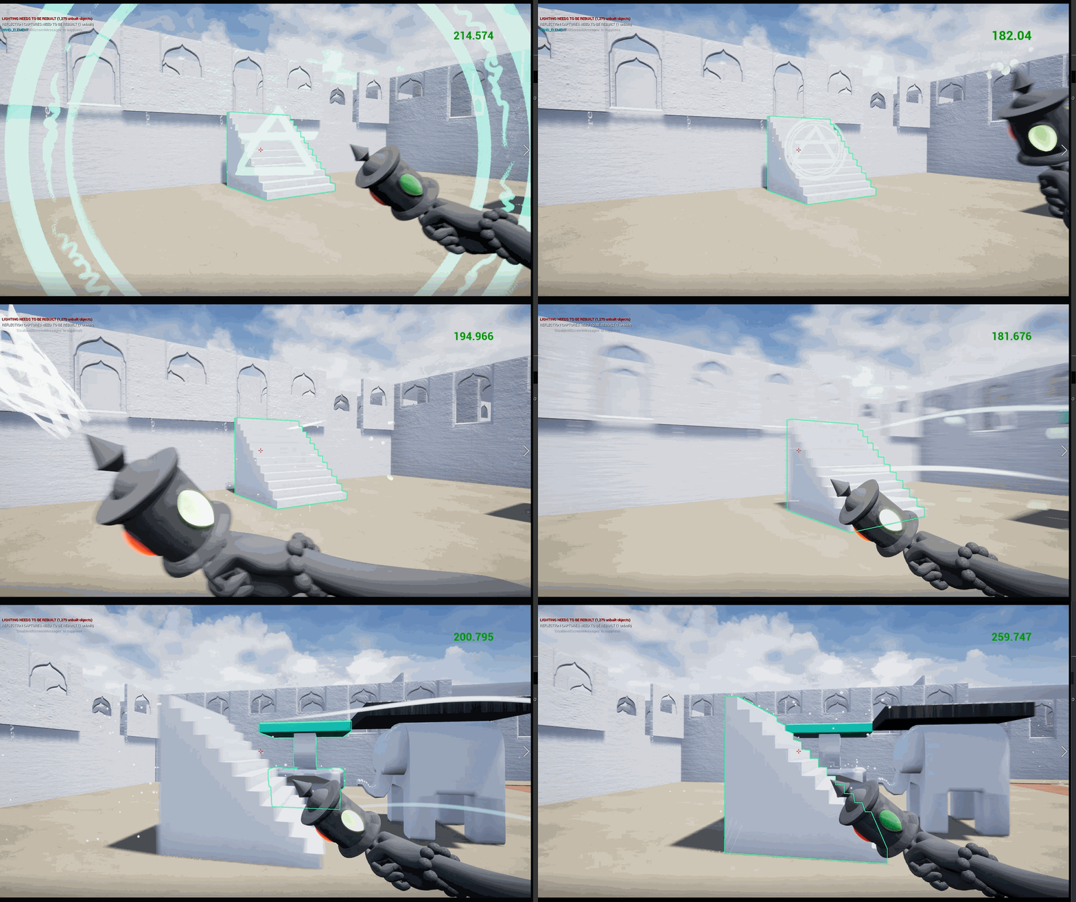
Example 2:
Prototype Stage
The player casting Wind Spell
Solutions 2:
-
The target is shaking when the player is casting the wind spell on it.
-
The target is moving with sudden acceleration and deceleration.
-
The direction of the arm animation matches the target's moving direction.
Result 2:
Final Visual Performance
The player casting the Wind Spell

Challenges and Lessons:
The spellcasting system design taught me how to solve complicated problems step by step. It required lots of communication between disciplines, and at the very beginning, I struggled to convey my ideas through words. I found references from movies and games as well as drew pictures to help me explain my thoughts clearly.
NARRATIVE DESIGN
Design Goals:
-
To tell a story without any text
Solutions:
-
Using cutscenes to draw the player's attention
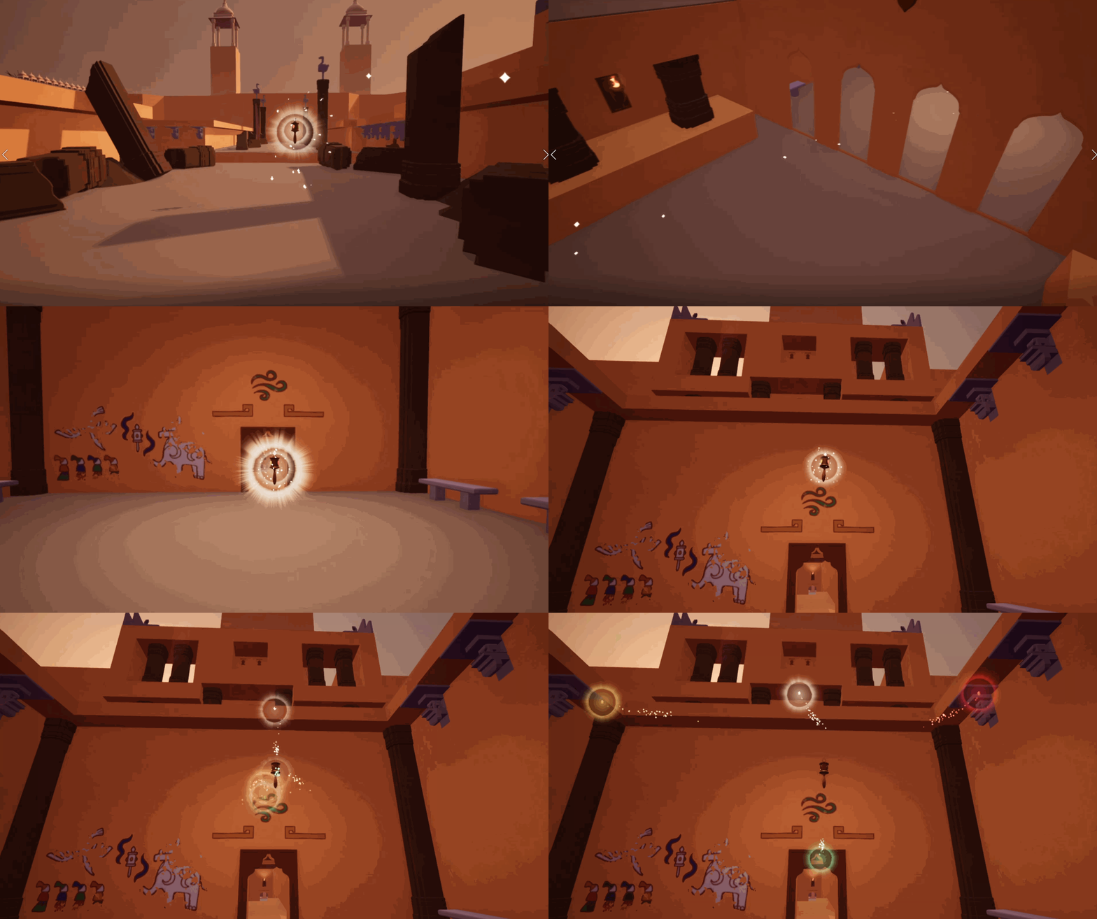
Example: By chasing the wand and seeing the gems split off, the player experienced its magic.
-
Using wall paintings to present the past of the artifact
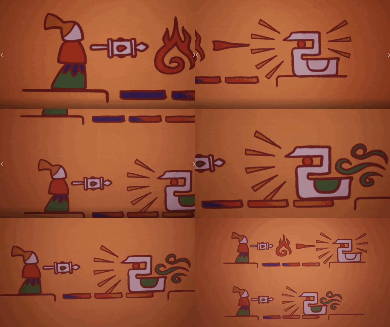
-
Setting up a unique atmosphere with different instruments for each level

Game Moment For Narrative
Example 1: Using a bansuri to create a curious mood.
Example 2: A similar rhythm using a dilruba to create a relaxing mood.
Example 3: A similar rhythm using a horn and a tuba to create a dangerous mood.
( Musics Credited by the composer )
Challenges and Lessons:
The challenge came when we tried to create a narrative that was both abstract and expressive. Some players struggled to understand the purpose of the paintings relating to the story while others found it hard to learn the mechanics they tried to teach. Finding the balance was a struggle but in the end created an immersive experience.
WORLD LAYOUT DESIGN
Design Goals:
-
To create a realistic non-linear world space
Solution:
We constructed the temple with a central hub and several hallways splitting off different sections. Though the player starts at the central hub, they cannot access further areas without first obtaining the appropriate abilities to clear the obstacles blocking the path. This design allows the player to have a strong understanding of the temple after returning to the central hub several times.


First Pass World Layout
Final World Layout
Example:
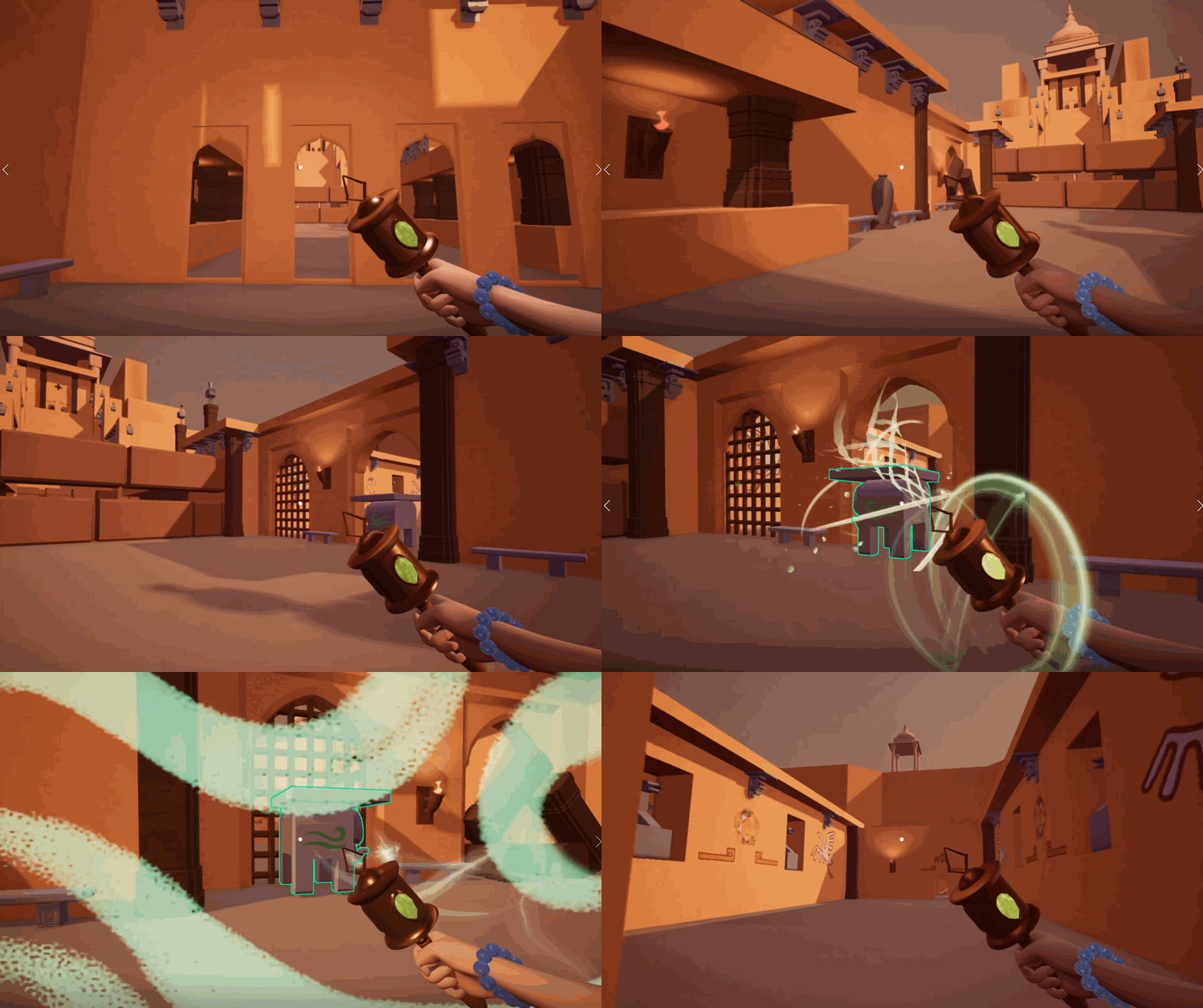
The first time the player returns the hub, they can only go right with their wind ability.

The second time they return the hub, they can cast their earth ability to generate a bridge to the next level.

The third time they come back to the hub, they can burn the pillars by using the fire ability which gives them access to the next area.
Challenges and Lessons:
We made a mistake with the layout design because we forgot to leave space for the tutorial level, which created a problem in the alpha milestone. After leaving the tutorial room, the player is supposed to look at the worship, the landmark. However, they should visit Level 1 next, which locates in the tower, in the opposite direction, making it impossible for the player to see the landmark. We had to give up the original idea to direct their attention in the correct direction.
POST MORTEM
What went well?
-
Solid puzzle mechanics
At first, we were always excited about complicated and intricate gameplay. However, I insisted to start things simple and successfully got support from the other designers. It proved to be a wise decision since we were able to create interesting gameplay with these core mechanics.
-
Focus on teaching and conveying the player
We developed a camera flying functionality to show players the intended routes. We also added wall paintings as tutorials. Based on our last playtest, players had little confusion about what they should do and enjoyed the exploration.
What went wrong?
-
Poor communication and low morale
Because of Covid-19, we started the project online. This caused communication harder because information easily got lost via microphones, especially for me as a non-English speaker. We struggled to understand each other precisely and reach a clear goal as a team, which also resulted in low morale for months.
-
Quality lower than quantity
In some milestones, we were too anxious to plan deliverables well. We were ambitious to prove ourselves but ignored the importance of quality. Things came out rough and were not to the quality we had planned, so we had to spend more time refining them.
What I learned?
-
How to say NO wisely
As a lead, it's easy to say yes and make everyone pleased, but It's not a good way to direct all of the team members down the correct path. I learned a great lesson in this project about how to express my true thoughts and explain clearly when some creative ideas or suggestions did not fit the intended design.
-
How to use different communication skills with different people
Communication with people is a long way to learn. The same method does not apply to everyone. To communicate with my teammates effectively, I learned to know their personalities and preferences first, then tried to discuss things catered to them.


